Für visuelle Botschaften,
die ankommen.
imexha re-design

LOGOTYPE RE-DESIGN
My task was to re-design the existing Imexha logotype to make it more compact, legible in smaller sizes while keeping its characteristic appearance.
CLIENT
Imexha Agentur für Wohnkultur, Zürich
Brigitte Bartholémy
before & after


The initial logotype was not designed by Atelier Tschachtli.
goals
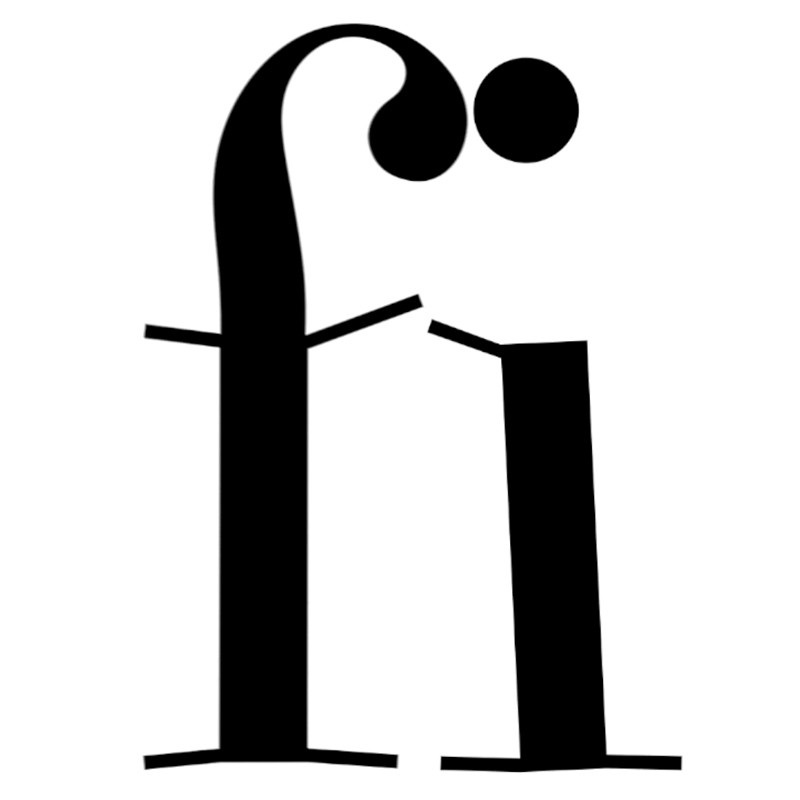
BETTER LEGIBILITY
Synthetic names are often more difficult to read at first. To optimize legibility, I changed the angle of the "x" strokes which greatly reduces the visual similarity to the letter "t" (imexta). The small size of the tag line in relation to the logotype has been increased. This way the logotype-tagline combination can be used relatively small while still being legible.
SIMPLER SHAPES
The re-designed "x" forms a ligature to simplify the connection to the letters "e" and "h". I was able to use the existing curvature to form one of the "x" strokes resulting in an overall simpler logotype while keeping its characteristic motion.

Projects